Poster of a Girl: 1981 Edition [1981 Week]
/I just love movie poster analysis too much to not do it in a theme week. I know things often repeat themselves, but to me, instead of getting boring, drives the points just home even more. So here we go again, 1981 style!
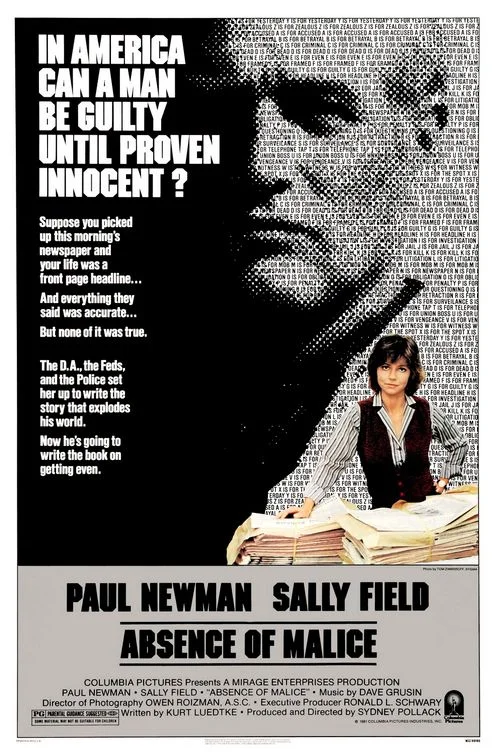
I love the expansive tagline that reads like a whole thesis instead of some sentences to make people want to see the movie. But it is a provocative question that shows some of the disillusion still going on in 1981.
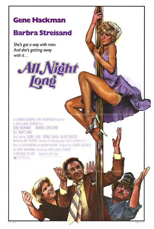
In some way, this portrays Barbra Streisand as a strong character because “she’s got a way with men” but this just brings back the maneater trope again (see Bette Davis Eyes). And it doesn’t change the exploitative depiction on this poster.
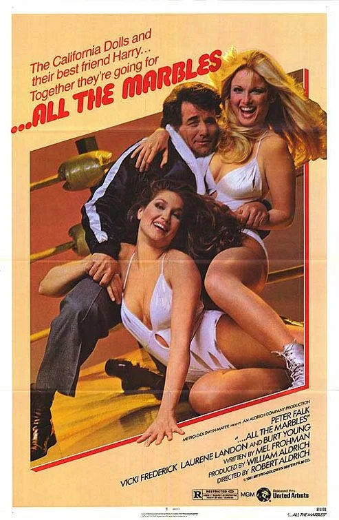
With different names associated with this movie, it would seem like some C-movie nonsense, but it has Peter Falk in a lead role and Robert Aldrich as a director. That doesn’t help this poster, which could’ve gone for “strong girls have their way” but is undercut by the joke of clothes they are wearing.
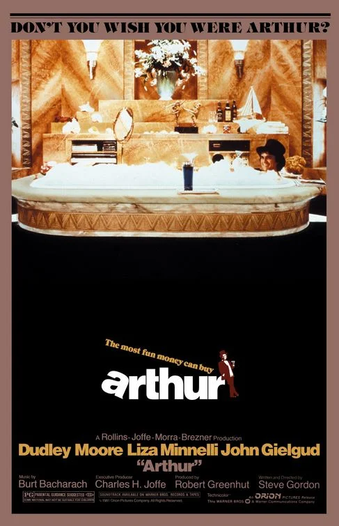
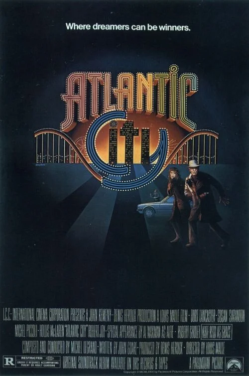
The question at the top of the poster implies that everyone wants to live a life of wealth and leisure, which is probably true, since this is the distant promise we all get for working daily, boring jobs. But we know already that the movie will then tell us that actually other things are more important than money and I assume that Arthur will have to learn that contradicting lesson.
Note for the “can” in the tagline. This implies that normally, dreamers are always losers, but here, in Atlantic City, this is exceptionally different. How depressing.
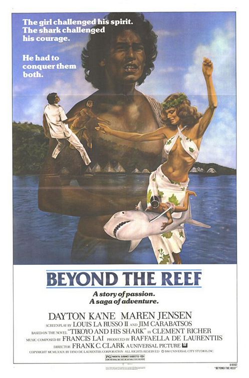
This really seems like a lead character for some tribal man on an island, which would be quite unusual. Who is he? Why does a girl challenge his spirits? And, worst of all, why does he have to “conquer her”? Or the poor shark for that matter? Had I known it existed, I would have tracked this movie down because it looks intriguing, to say the least.
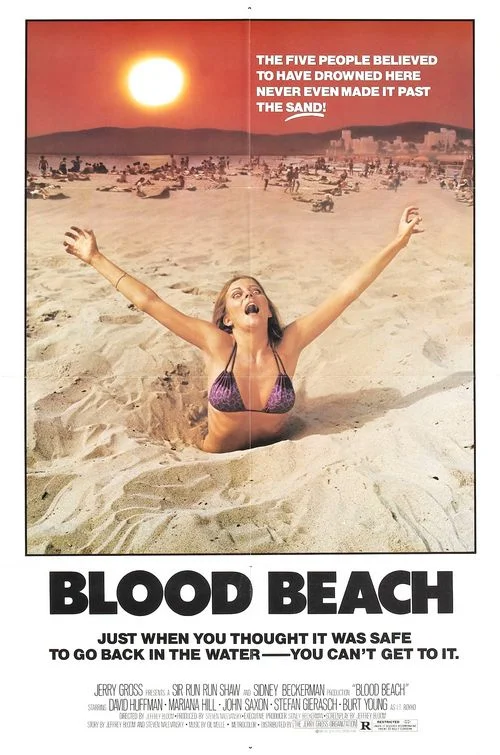
And the first entry in “We love using women as victims!” The whole ridiculousness of the concept (both taglines are hilarious) somehow makes the abuse of the bikini girl even worse.
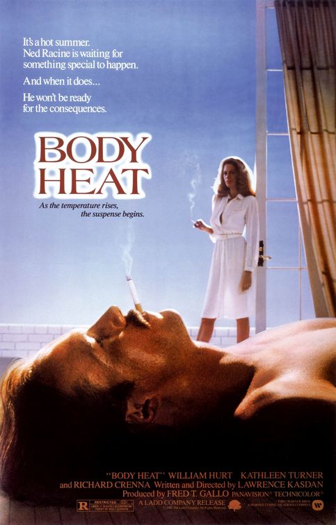
Hm, maybe 1981 is also the year of predatory women. See how, again, the poster takes his point of view, turning him more into a victim and her into the mantis.
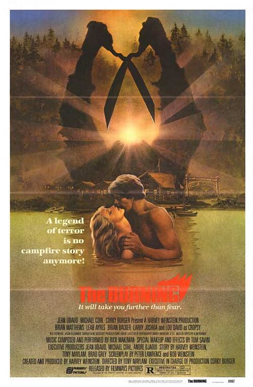
Again, I have to say, both taglines are incredibly clumsy here. But more importantly, there couldn’t be a better way than showing that people in horror movies get punished for having sex. At least it seems it will be more the castration punishment than the impalement punishment, if that counts for anything.
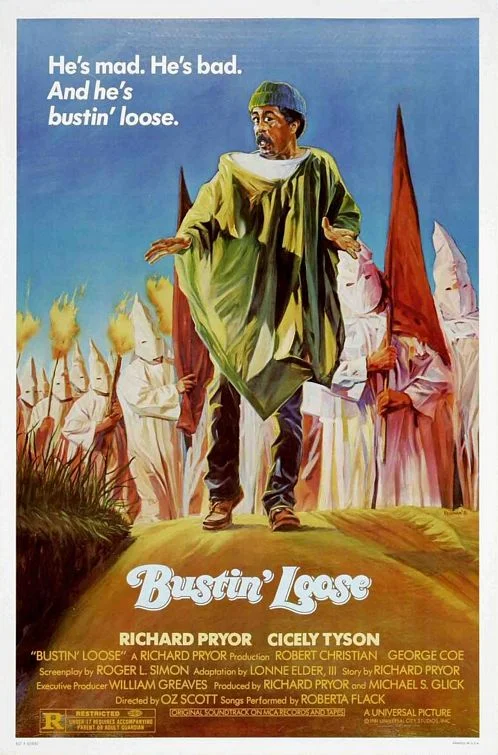
Take a moment and imagine any possibility that such a poster might be printed today. For all the sexual and sometimes racial exploitation happening in movies and posters of 1981, at least there was also room for something as outrageous as this. I don’t think any movie would get away with this today and that is a bitter thought.
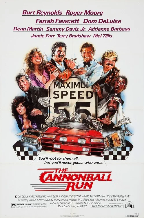
We have it all! Men! Cars! Women who squeeze out their breasts! Ethnic stereotypes!
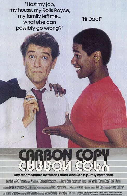
The concept sold through this movie is… well, it is a concept, to be fair. But look how the tagline implies how horrible this discovery is for the white dad. How is finding out that you have a son worse than losing everything you had? Oh, I see, because he is black. That’s awful then of course.
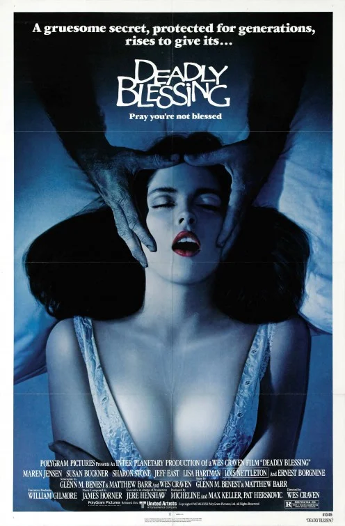
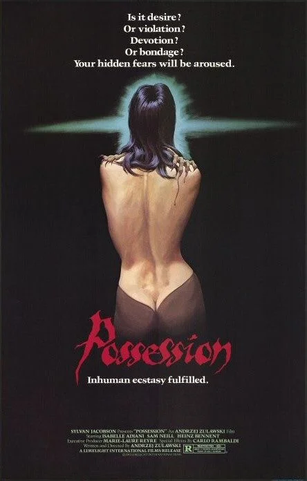
There is a really thin line here between depicting her as a victim or as having an orgasm. Which is a weird line. Also, whatever she is wearing, well, there is no need for her to wear it.
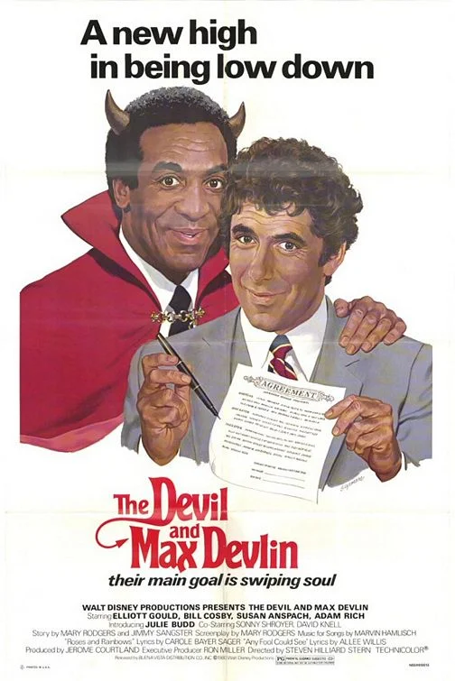
Okay, a black man as the devil is awkward. Seeing this in 2015 is beyond awkward and it’s kind of amazing that no one has used this poster for any of the millions of Cosby stories (or maybe someone has, it’s perfect!).
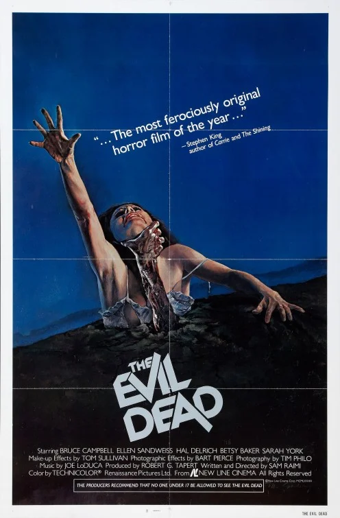
Even a great movie like The Evil Dead can have a poster that is generic in its use of a female, half naked victim. I know the poster is somewhat iconic and it is concepted much more interestingly than most of the others here, but the main problem remains.
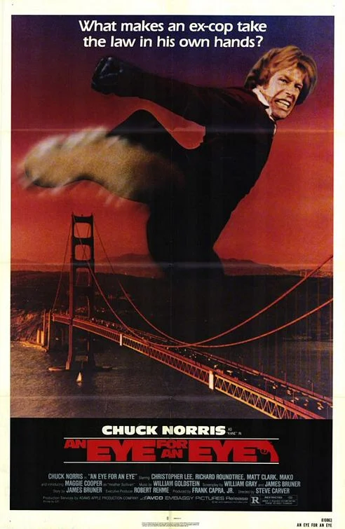
That is a great question feeding into my ongoing discussion of vigilantism. The answer here seems to be the Golden Gate Bridge. Take it down, Chuck!
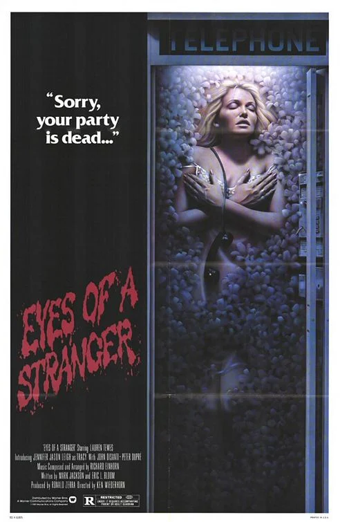
“I have a new idea! We bury her, half naked of course, in a phone booth full of… stuff. No one has done that one yet.”
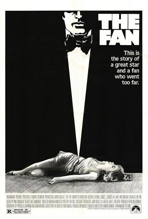
So much for the sexual implications of impalement.
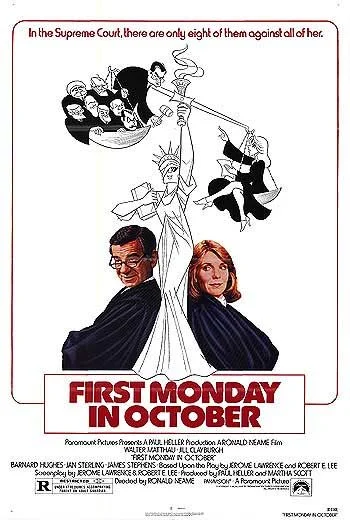
This poster drives me crazy, only because I have seen the movie and the poster is so inaccurate. It depicts the struggle of one woman against everyone else when the movie is only about her struggle against Walter Matthau. At least she still shows some leg as if the movie really is about her being sexy.
One of the most iconic and sexist posters probably ever created. The tagline is really not helpful.
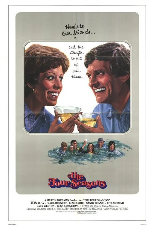
The cynicism of this poster is fascinating. It’s a movie about friends and how horrible friends can be. Hard to believe from the poster, but this is one of the top 10 most successful movies in the U.S. of 1981.
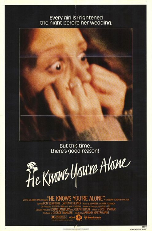
Having a woman as a victim in such an extreme horrified way is one thing. But adding the same oversized picture as a little icon on the title is really too much.
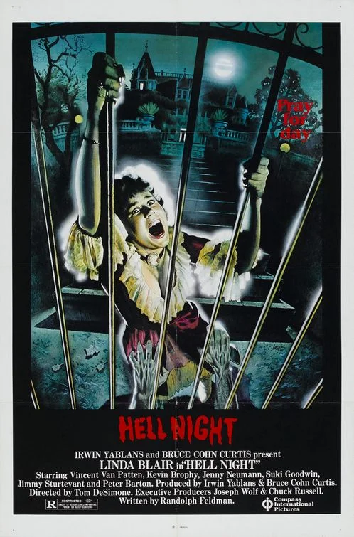
At least for this female victim it’s hard to tell that it is actually a woman because the cleavage is there but not focused and the colors somehow de-sexualize her. Poor Linda Blair!
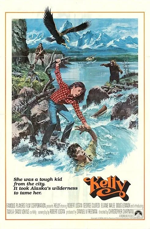
Ignore the awkwardness of the drawings here which rob any chance of making this seem realistic. Focus instead on the idea of “taming” a young girl and adding an eagle and a bear to see how “wild” she really is.
Is it too many questions? Is she just about naked enough? Is this 50 Shades of Grey of 1981?
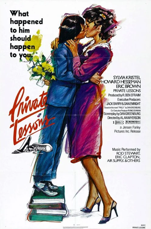
Sometimes I can’t get beyond one single word that makes all the difference. Okay, he seems to have an affair with his teacher, that’s nothing new. But the tagline says this “should” happen to you too. Should! Like in “You should really drink enough every day.” or “You should call your mom more often.” It seems you should also have affairs with older women if you’re a schoolboy. It’s good for you!
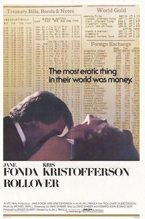
That is just an amazing poster and tagline. Don’t you want to see that movie too? Certainly a new way of connecting sex and money.
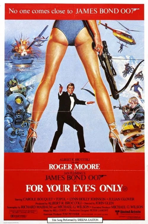
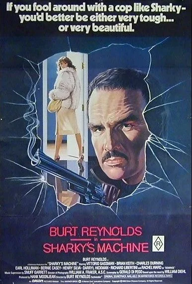
A real man like Burt Reynolds only needs tough guys to kill and beautiful women to fuck. He’s a machine. Ugh.
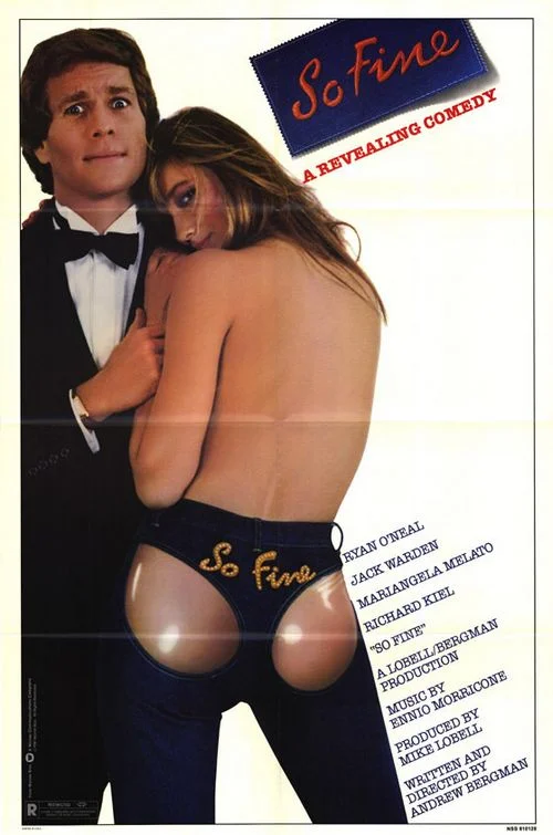
As if the poster wouldn’t stop you in your tracks anyway for its shining butt cheeks. But the tagline has the guts to call it a “revealing comedy.” Do you get it? Revealing? Do you really get it? Really?
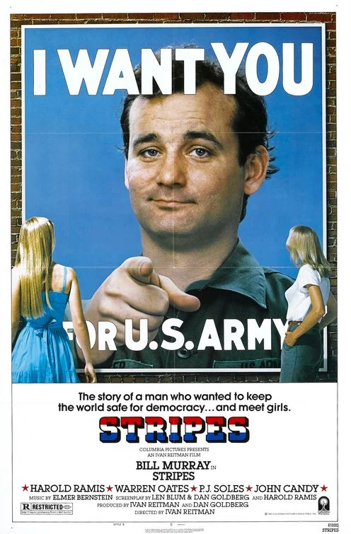
The poster strips down the concept of the movie to something more sexist than it actually is. If you think about it, it seems even weird how you want to meet girls by joining the army. But for the poster it doesn’t matter, there are girls on it.
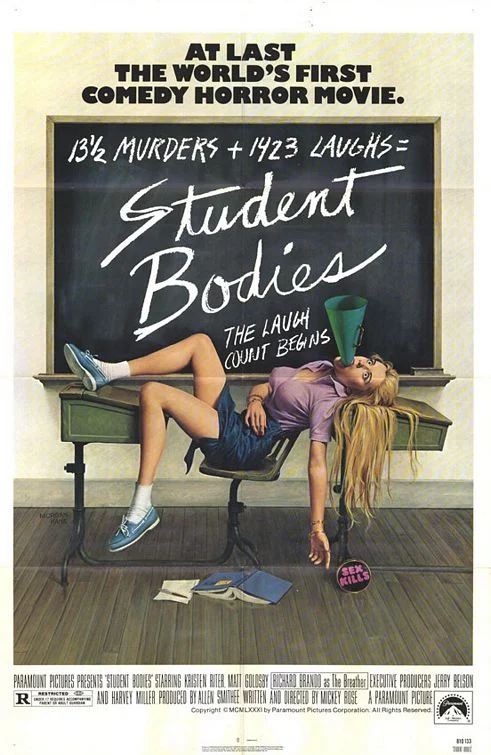
Aside from the terrible attempts at humor here (is that a precursor to Scary Movie?), the oral impalement really takes the horrible cake. Note that it is produced by Alan Smithee.
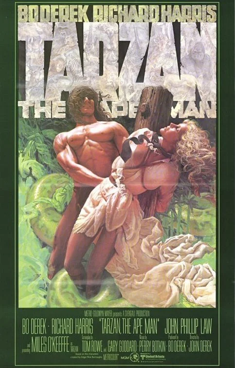
Wow, at least there is serious competition here who has bigger breasts. Luckily, she is tied up very conveniently, so that here cleavage is clearly focused.
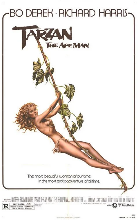
But we have to include the other version of this poster which doesn’t even feature Tarzan! Because in a movie about the most famous African hero (who is white), they decided to focus on Jane because she is played by Bo Derek, “the most beautiful woman of our time.” You have to admire how far the marketers went with this.
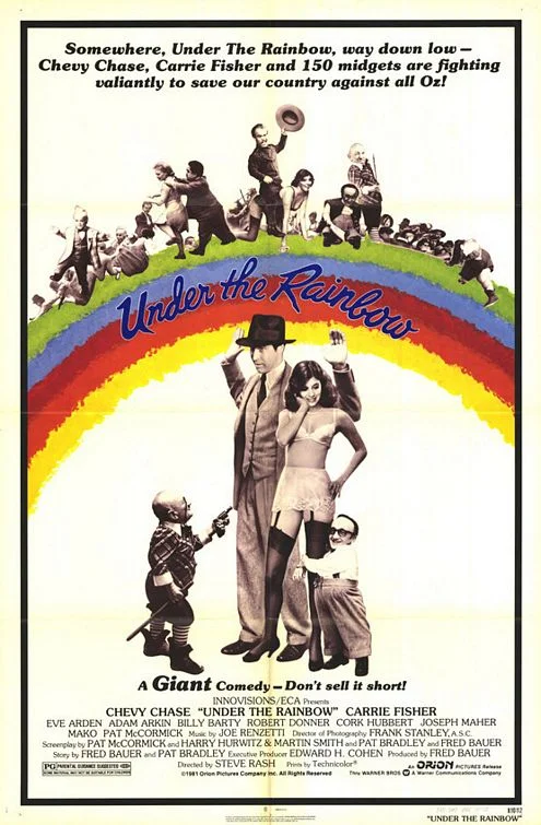
In the long history of strange movies about people with dwarfism, Under the Rainbow seems to fit right in. It has it all: jokes about “giant” and “short”, using the word “midgets” and Carrie Fisher (I guess?) in sexy underwear.
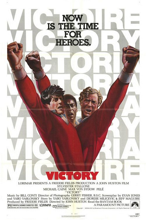
We’re finishing with one of the weirdest poster designs I can think of, that doesn’t tell you what it is about (soccer) or who its stars are (that’s Pelé in the middle) and that does something to their bodies that is hard to explain or look at, twisting them into one giant mash-up of an actor monster with impossible arms (especially Pelé’s) and tiny heads.

